Design Systems That Actually Get Adopted
Most design systems die in a Figma file nobody opens after the second sprint. The ones that survive share a few deliberate choices, and none of them are about the components themselves.
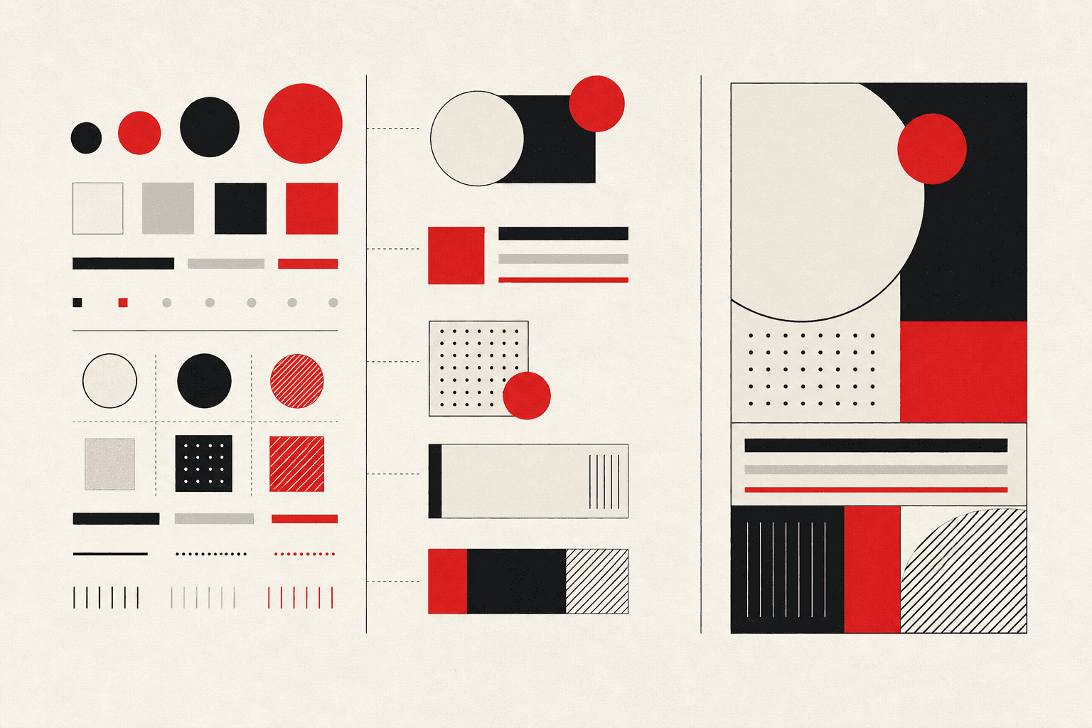
A design system's failure mode is rarely "the components are bad." It's that engineers quietly stop using them, reaching for a one-off <div> with inline styles because that's faster than working out whether an existing component covers their case or filing a ticket to extend it. Six months later the "design system" is a folder of components half the product doesn't use, plus a Figma file that stopped matching production. The components were rarely the problem. Adoption was.
Tokens before components
Teams that start by building components (buttons, cards, modals) before agreeing on the underlying values of color, spacing, and type scale end up with a system that looks consistent in isolation and fights itself in practice, because every component encoded its own version of "primary blue" or "medium spacing." Design tokens fix that: one source of truth for color, spacing, typography, and elevation, referenced by every component instead of hardcoded into each one. A brand or theme change becomes a token update, not a hunt through every component's source for a hex code. That is less impressive in a first demo than a polished button, but it decides whether the system scales or calcifies.
Documentation is the actual product
Nobody adopts a component they can't figure out faster than writing it themselves. The real deliverable of a design system is documentation that makes correct usage obvious in under thirty seconds: what props exist, what variants are supported, and what not to do (the anti-patterns engineers reach for under deadline pressure). A well-built component library with no usage guidance gets reimplemented ad hoc the first time someone's in a hurry and can't tell if it fits their case.
Build for the deadline-pressure case, not the happy path
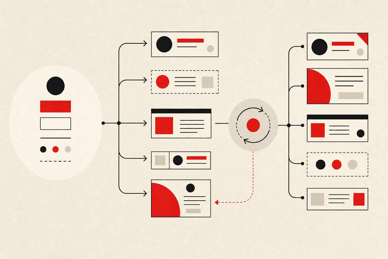
Every design system looks adopted when a team has time to do it properly. The real test is what happens when someone's shipping under deadline pressure and the system doesn't obviously cover their exact case. Do they extend the system, or route around it with a one-off? Systems that survive make the "extend it correctly" path faster than the "route around it" path: composable primitives instead of rigid monoliths, sensible defaults that cover 80% of cases without configuration, and an easy contribution path for the other 20% instead of forcing every edge case through a slow design-review queue.
Accessibility as a default, not a checklist
Retrofitting accessibility onto an established design system, after buttons, forms, and modals are already built and adopted everywhere, means touching every consuming surface at once. Handle focus management, keyboard operability, and correct ARIA semantics at the component level from the start and every product surface using the system inherits them, instead of needing its own separate audit and fix pass. Getting it right once, in the system, is cheaper than enforcing it in every feature built on top.
Adoption is a maintenance commitment, not a launch event
A design system that stops evolving after its initial release starts collecting the exact one-off exceptions it was built to prevent, because real product needs outpace what it covers. The systems that stay adopted keep a visible, low-friction path for proposing and shipping new patterns, and treat the system as a living part of the product rather than a one-time deliverable engineering "used to maintain."